


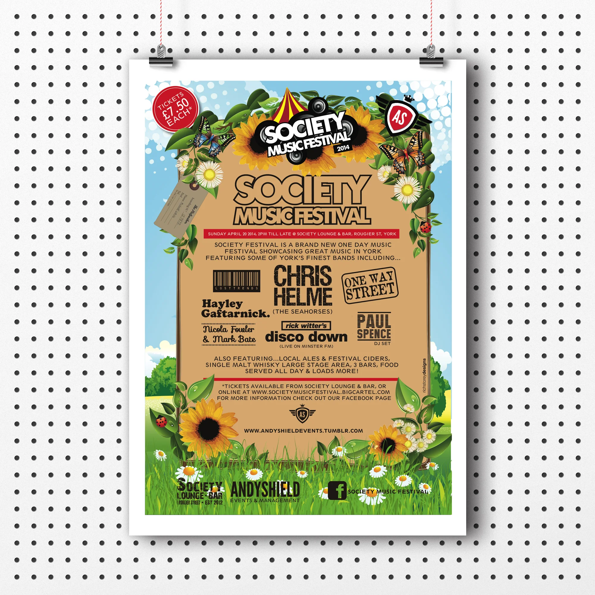


9
Huckleberry Lane

10
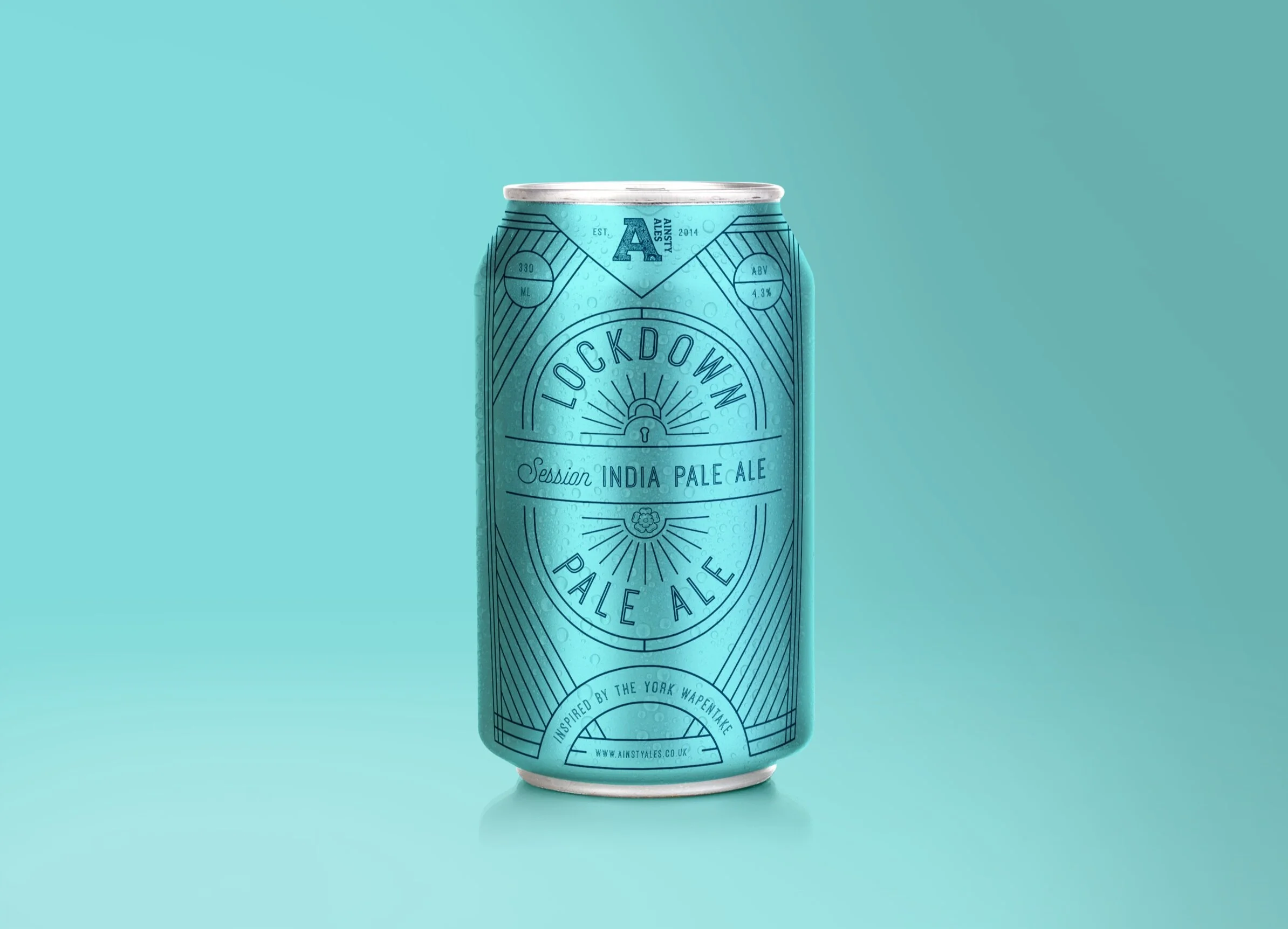
Ainsty Ales

2
Rolls Royce
6
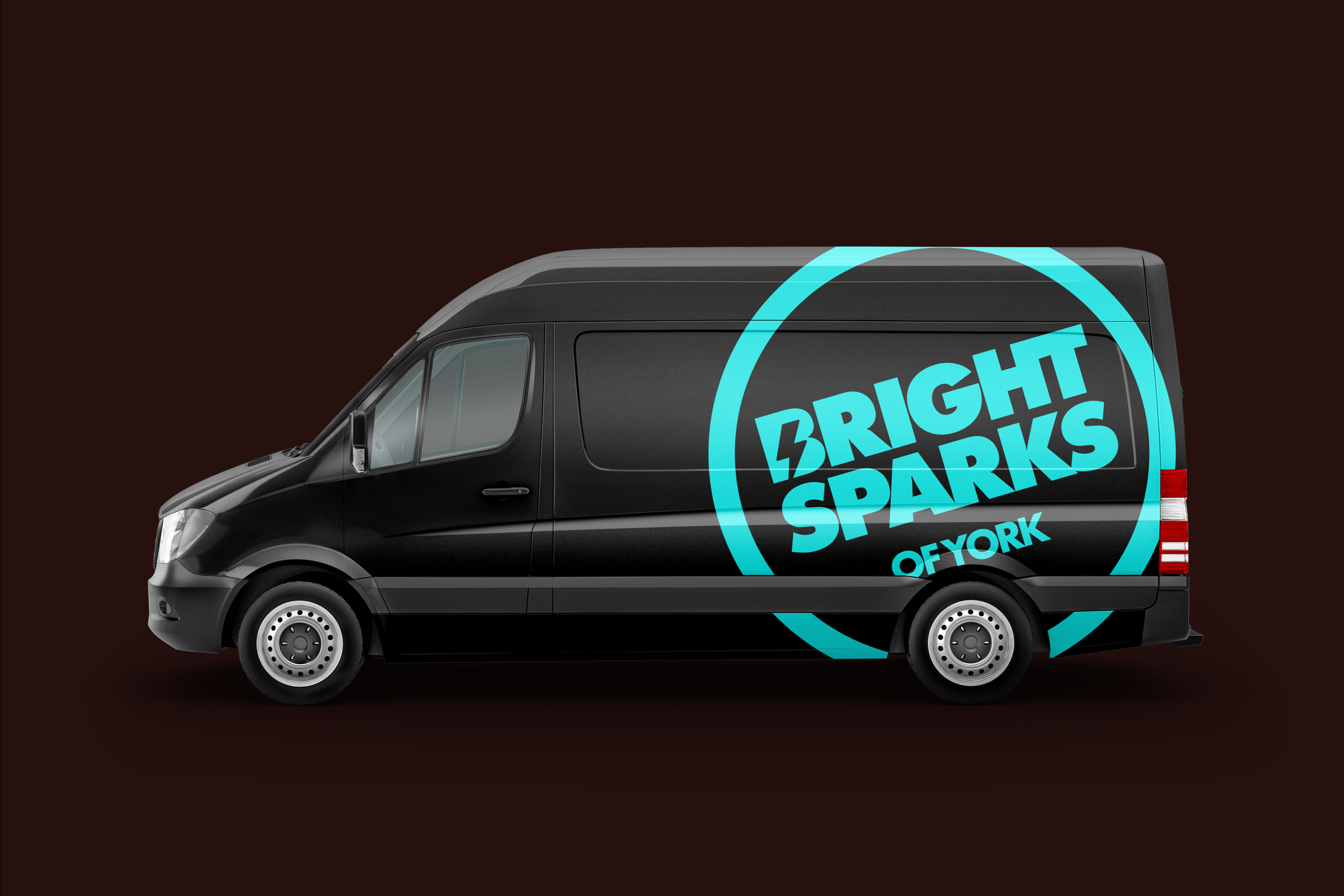
Bright Sparks

6
Anglo American

5
ToolBox
10
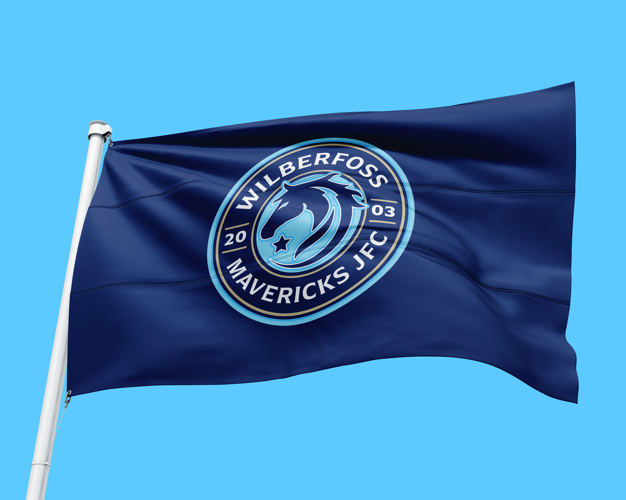
Wilberfoss Mavericks
6
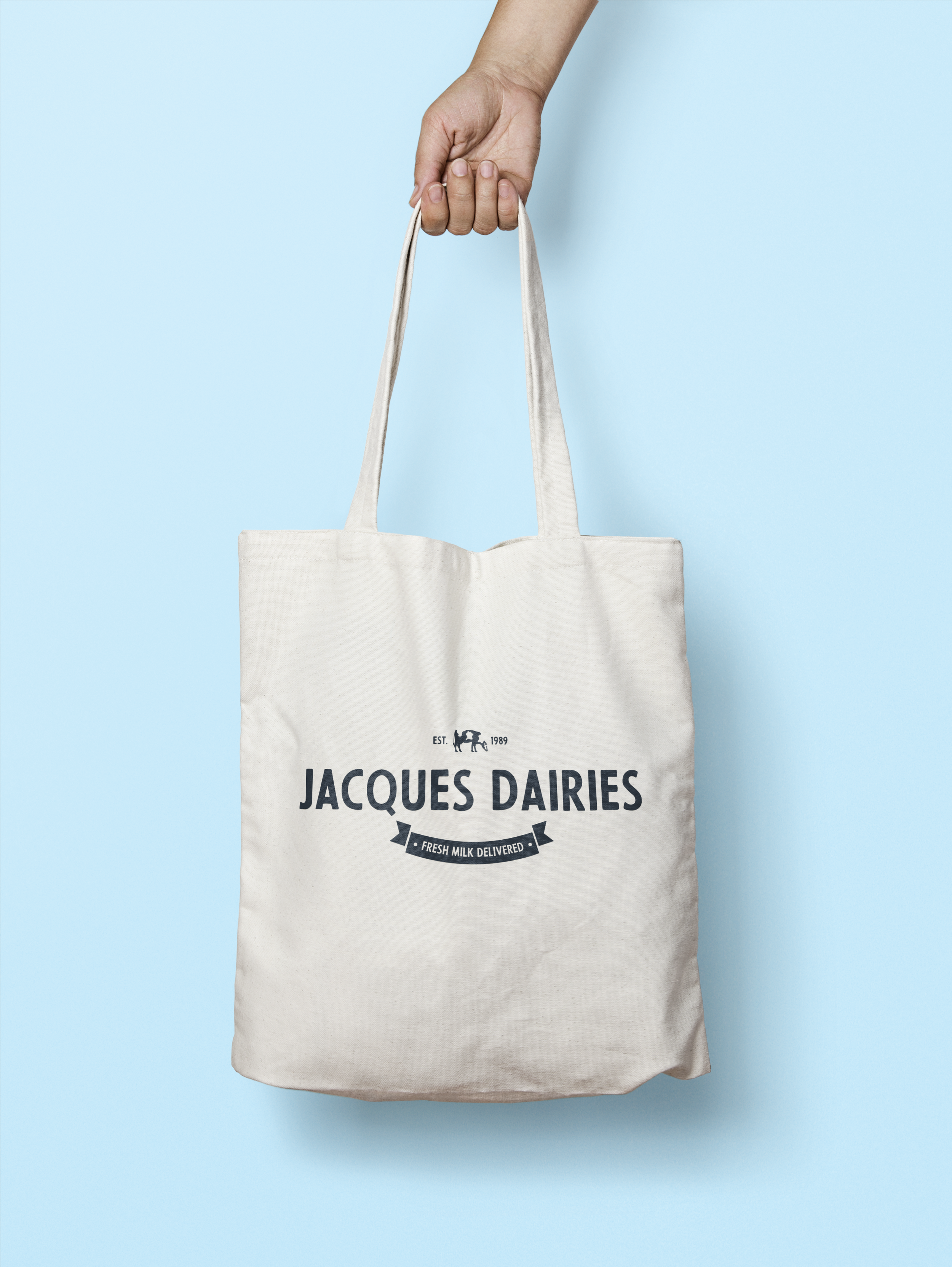
Jacques Dairies
7
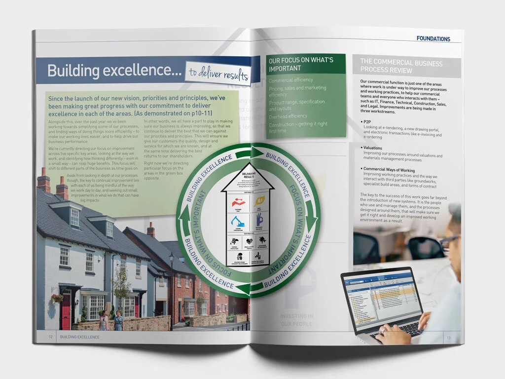
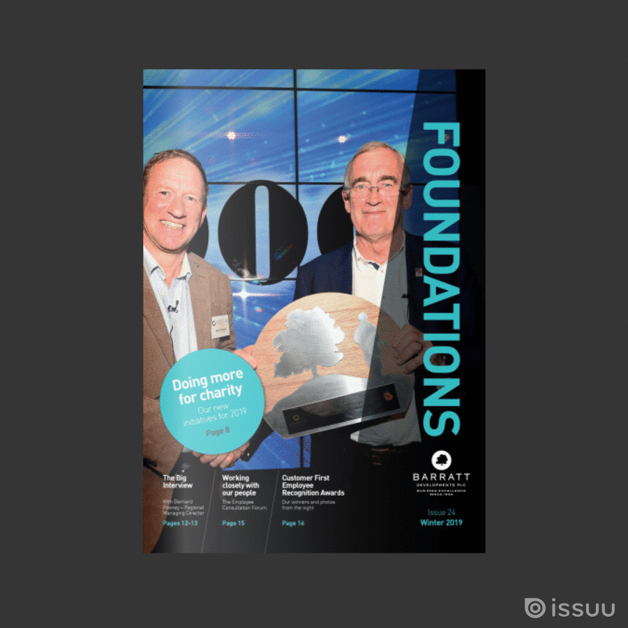
Barratt Homes

7
Stdy State

7
Lilith & Fae

5
AJ Services

2
St John the Baptist

5
Queen in Chains

5
The Coop Group
7
Ginger & Brown

6
Landmark3d

4
Ben Davitt

10
CogTech

3
Hyper

4
The Body Institute

7
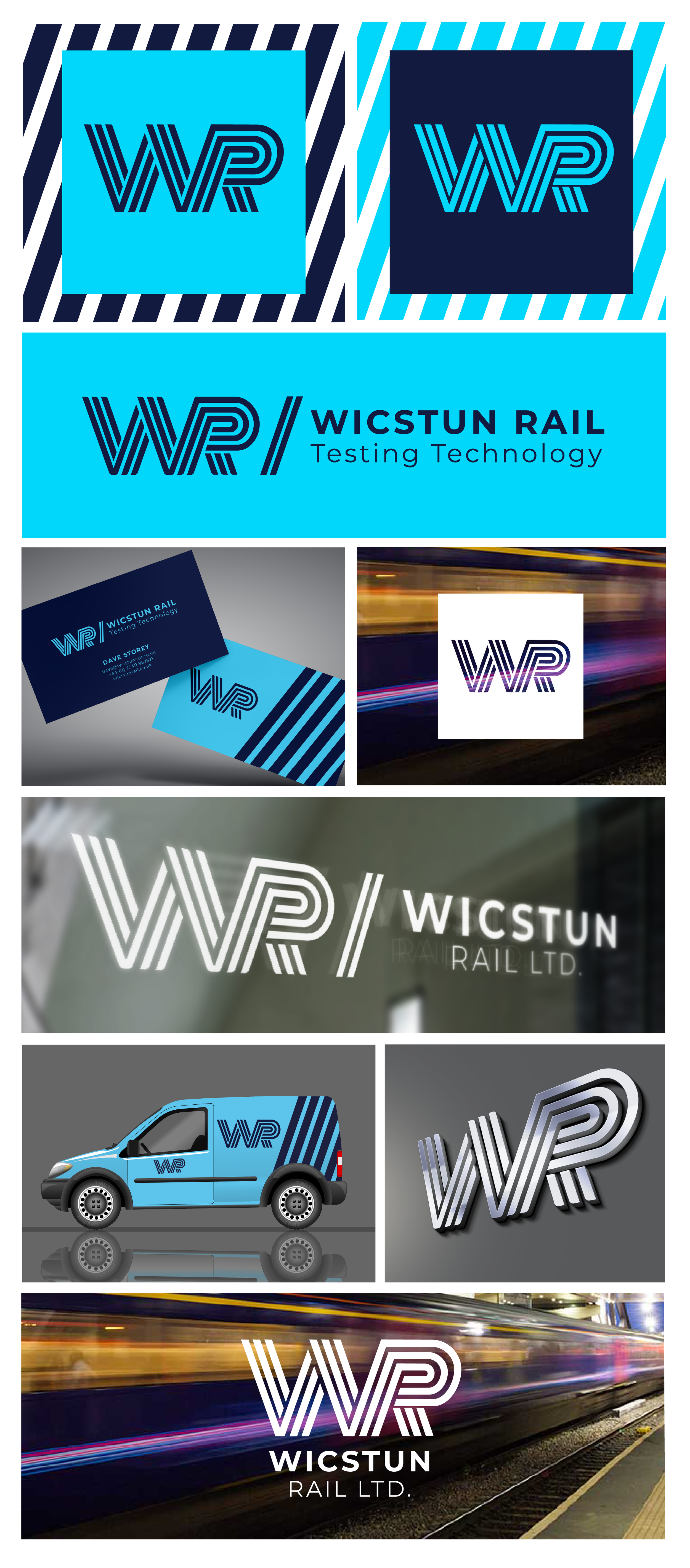
Wicstun Rail
5
The Drinky Tin
3
Bishy Road Tutors

5
Fighting Fit
4
Mare & Moonshine
4
Carbon Velvet

7
Express Electronics
6
Thora & The Prince

6
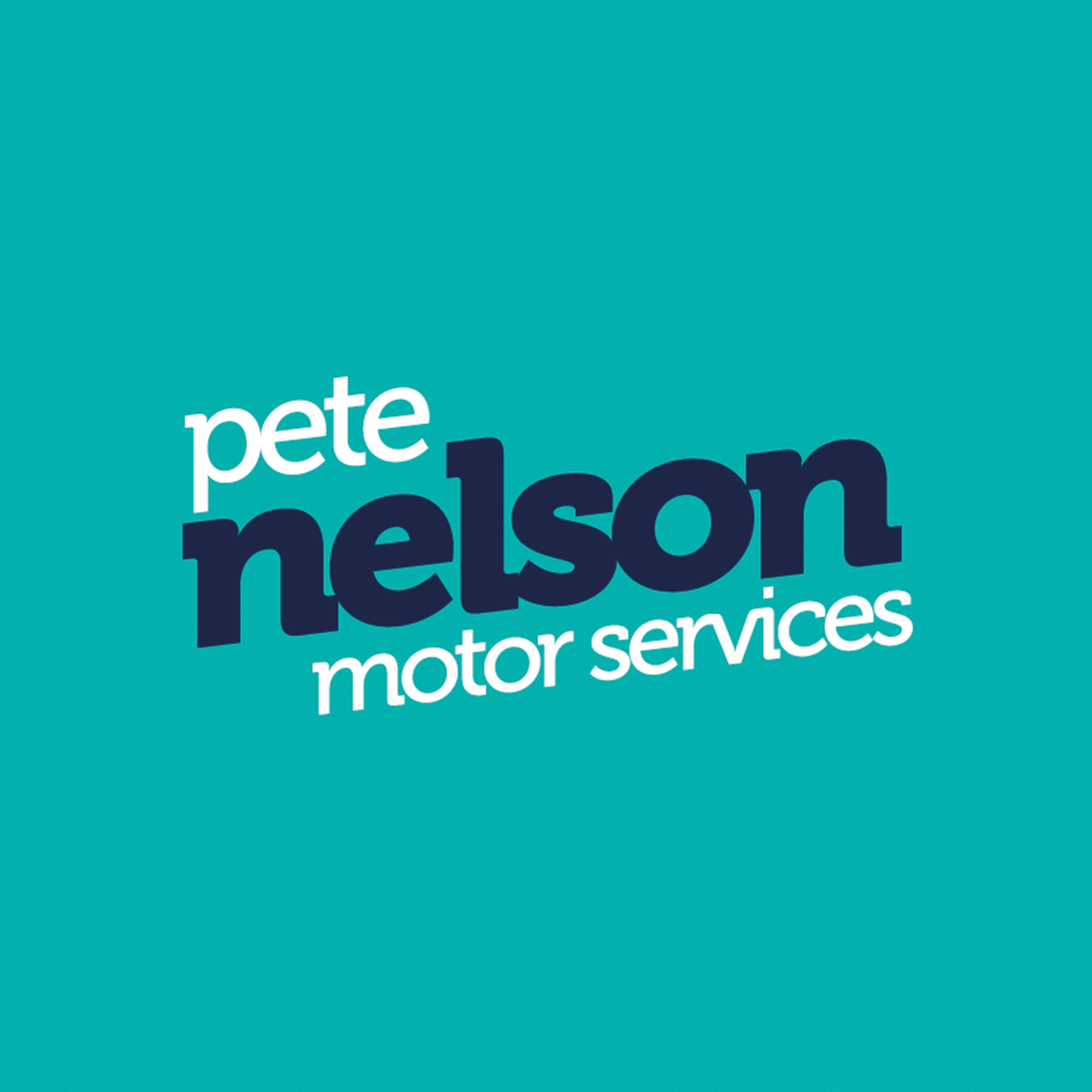
Pete Nelson Motor Services
3
Millfield Fitness
2
Fit4Duty
4
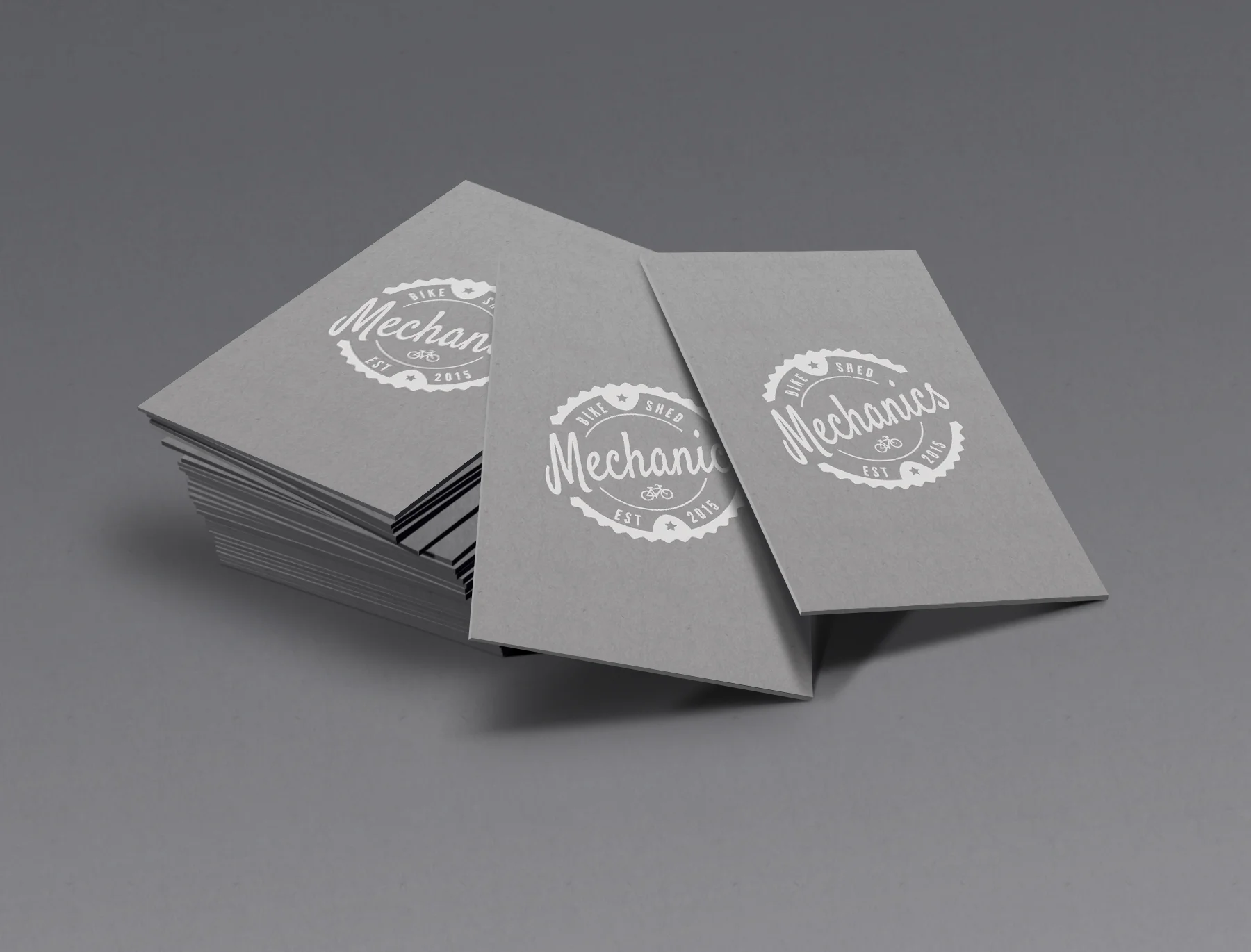
Bike Shed Mechanics
3
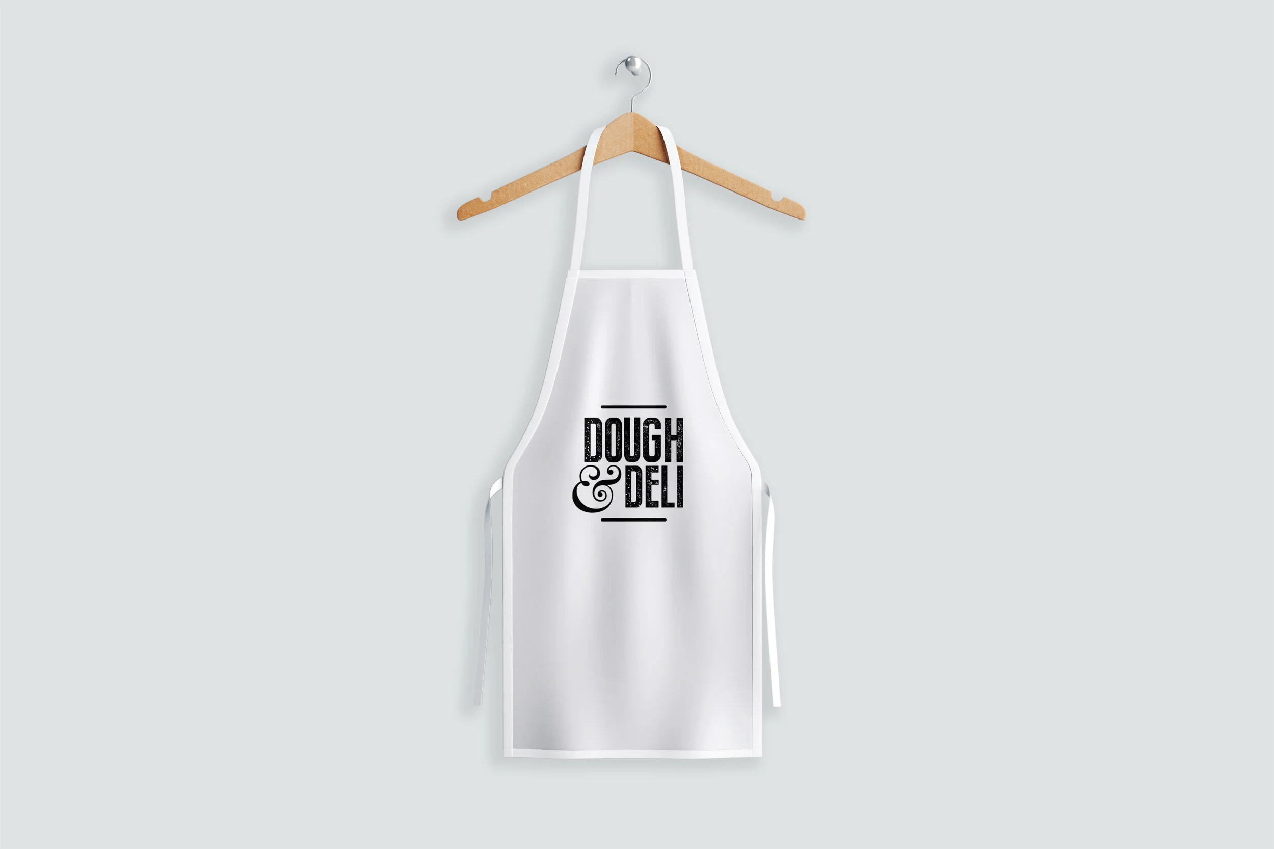
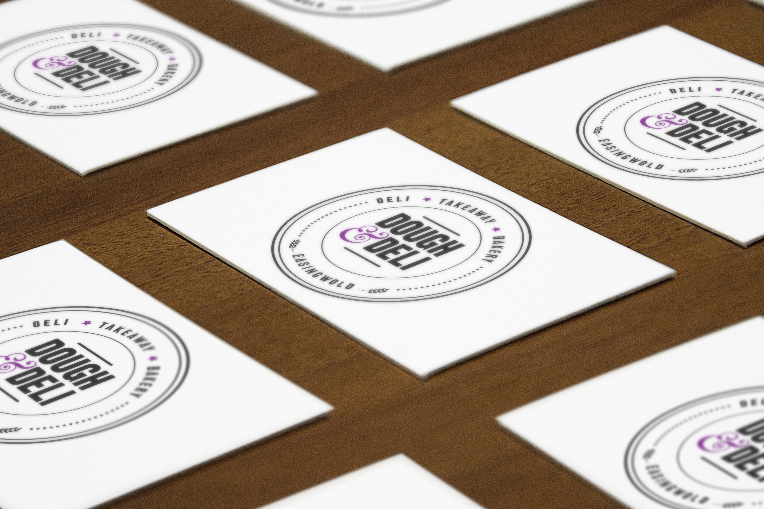
Dough & Deli
11
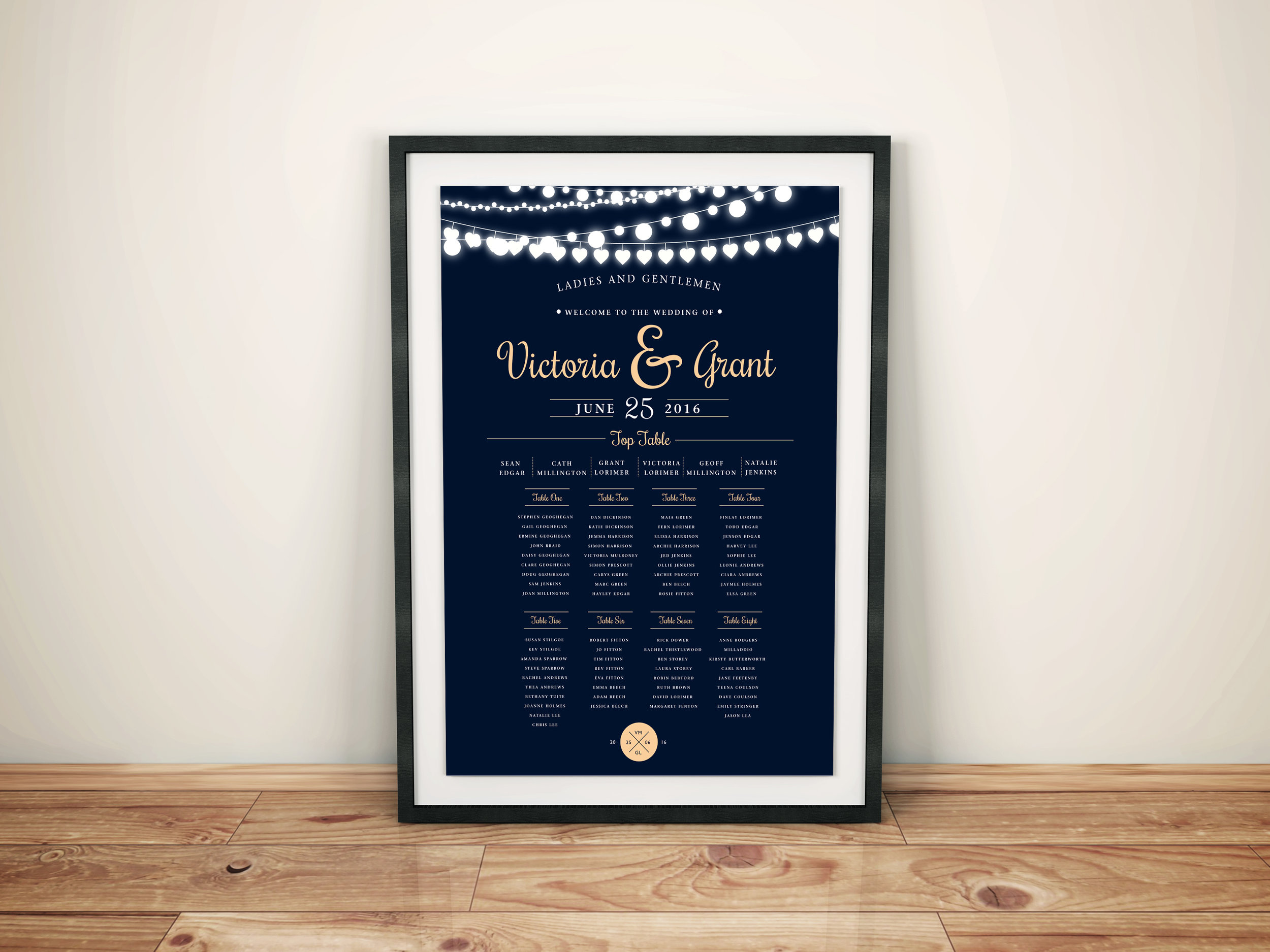
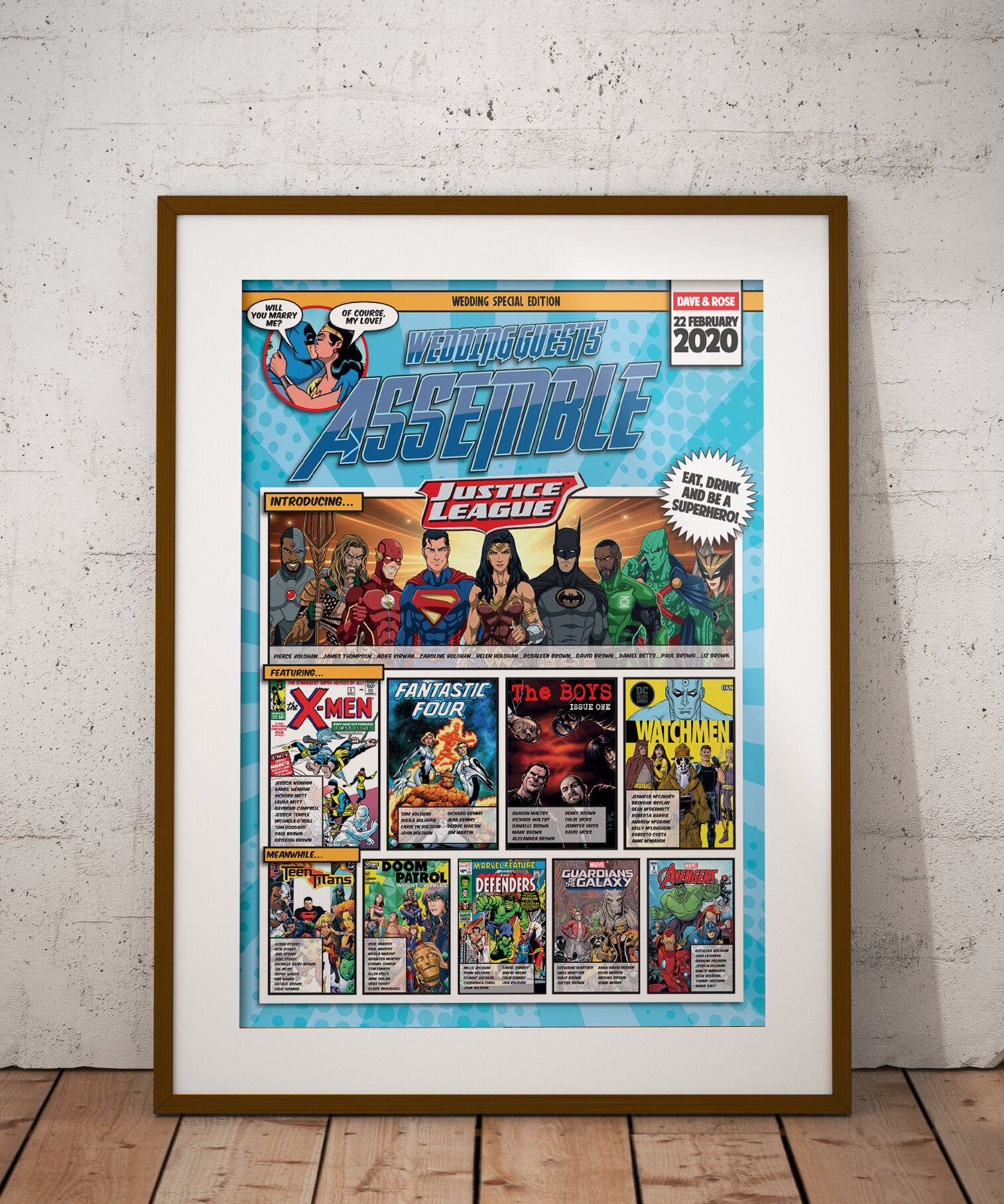
Wedding Stationery
21
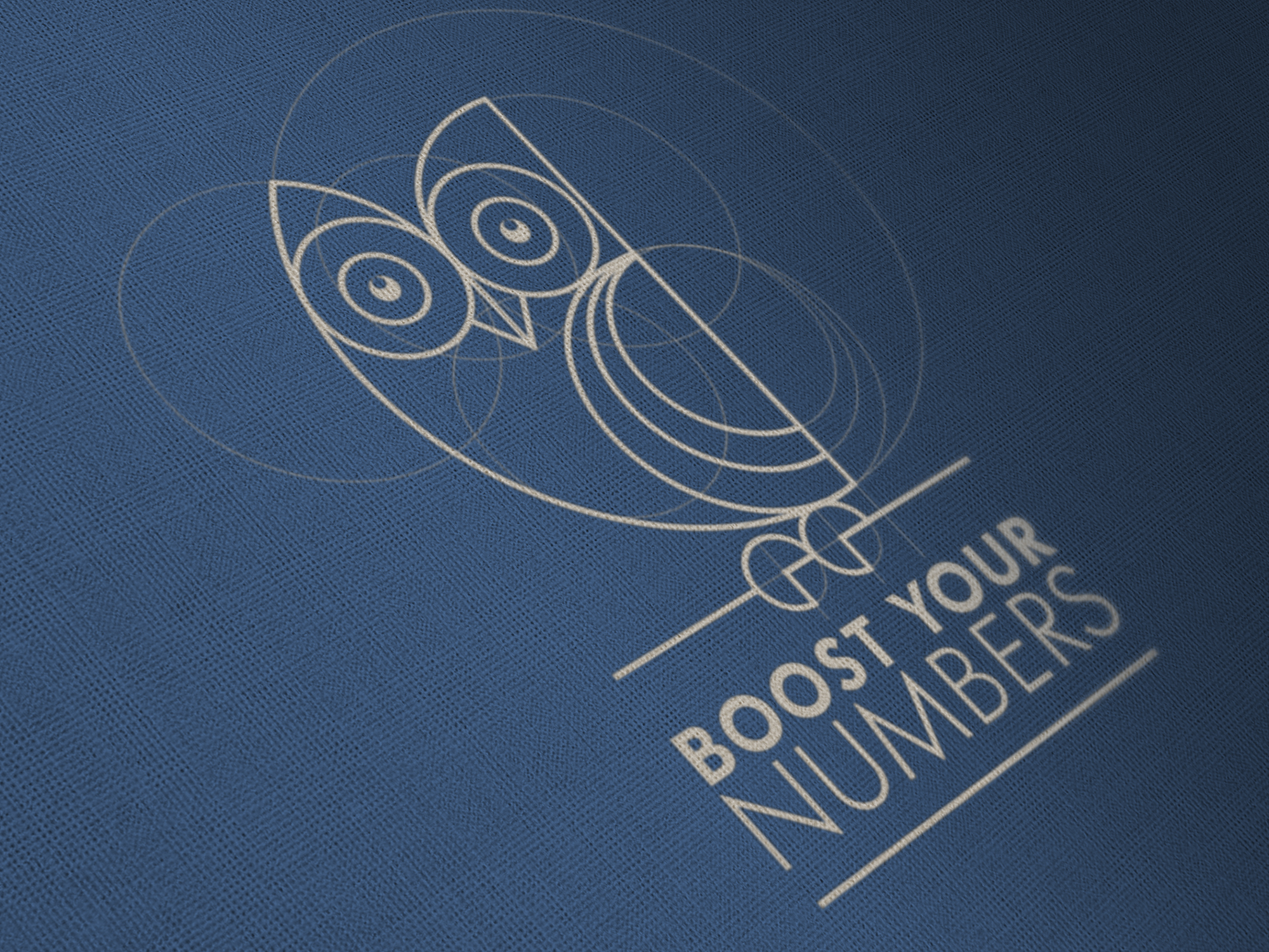
Logo & Stationery

11
Other Work